

Confession time.
I totally judge books by their covers. Do you?
Graphic design is a large component of my day-job in marketing and communications. I think my training gives me a unique appreciation for good design and a more sensitive eye for poor design.
I think there are some really stellar designs right now in the Christian fiction market. I thought it would be fun to share three of my favorites with you. Be sure and comment below some of your favorites — current or classics!

The Ringmaster’s Wife by Kristy Cambron
This elegant and timeless design leaves behind the often cheesy, transient images often evoked by circus life. The muted colors tells me the story will be about way more than just an entertaining act. The way the subject is looking off foreshadows longing, searching — a concept emphasized by the foreground being partially covered by the red drape. I’ve not yet read this book, but it’s on my shelves waiting.

The Bachelor Girl’s Guide to Murder by Rachel McMillan
I mean, how cute is this cover? I particularly LOVE typography and think it can make or break a cover design. The subtle imagery around the edge makes you really look and pay attention to detail. It’s quirky and mixes nuances of Shirlock Holmes and Murder She Wrote, no? I firmly believe a font can make or break a cover design. Here, the serif font of the title is classic and yet just interesting enough to stand out as different. LOVE this!
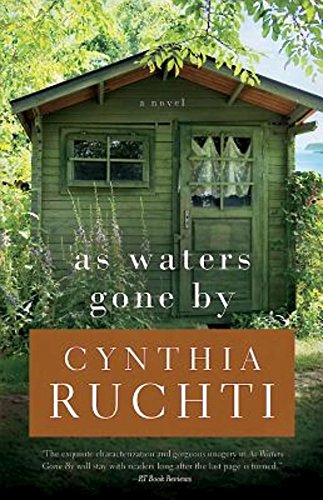
As Waters Gone By by Cynthia Ruchti
This very simple design is inviting and speaks to my personal love of mountain cottages. I want to live there, don’t you? It enlivens my senses. I can smell the damp earth, feel the breeze, hear the leaves rustling. But with the window covered on the door, there’s clearly things to be revealed/discovered in the story. Little touches like that are great!
My next newsletter hits inboxes tomorrow!
If you haven’t already signed up, be sure and do so HERE
for fun exclusive content, writing samples, and more!


One thought on “Book Snobbery: Cover Judging”